
Contents
- 00 — Overview
- 01 — Foundations
- 02 — Logo
- 03 — Colors
- 04 — Typography
- 05 — Visual Language
- 06 — Writing & Voice
- 07 — Applications
- 08 — Downloads
- 09 — Canva
- 10 — Governance
Status labels (Approved / Observed / Proposal / Pending) apply as online. Interactive elements are available online only.
LPDP Groningen / Brand Identity System / V 1.0.0-rc.1
One identity, kept together.
The community’s reference for using the LPDP Groningen logo, colors, typography and voice consistently — on the web, in event publications, presentations and social media.

Chapters
Ten chapters, one system.
Each chapter separates approved rules, observed implementation, and proposals that still need project-owner approval.
- 01FoundationsAbout the community, essence, slogans, audiences.
- 02LogoApproved mark, variants, use, misuse, provenance.
- 03ColorsFive core colors, contrast, combinations.
- 04TypographyThree families, scale, licences.
- 05Visual LanguageSpace, grid, borders, icons, photography.
- 06Writing & VoiceTone, terminology, do and don’t examples.
- 07ApplicationsWeb, social, posters, slides, templates.
- 08DownloadsLogo files, ZIP, PDF, tokens, checksums.
- 09CanvaAssemble and verify a Brand Kit manually.
- 10GovernanceApproval, versioning, exceptions, reporting.
Extended technical documentation: Explore 19 Design System topics, including the proposed logo story.
Reading the labels
What is settled, what is not.
Approved
Taken from the canonical website documents: ecosystem design contract, design freeze, logo contract, typography governance or copywriting guide.
Observed in website code
A pattern actually used in the website code, but not written down as a rule.
Proposal — needs approval
Proposed by this portal. Usable as working guidance, but not an official decision until approved.
Pending
Not yet available or blocked by external access. Never shown as if it exists.
Release status: Release candidate — awaiting owner review. These guidelines govern the LPDP Groningen community identity — not the identity of the LPDP institution, universities or partners.
01 / Foundations
A community identity, rooted in a city.
LPDP Groningen is the community of LPDP scholarship awardees and alumni in Groningen, the Netherlands. Its visual identity helps members, the committee and collaborators speak with one recognisable voice.
A / About the brand
Why this identity exists.
Purpose
Recognised and trusted
Community publications are recognisable as LPDP Groningen and feel trustworthy — without being redesigned each time.
Positioning
A community, not an institution
LPDP Groningen is a Groningen-based community. This identity does not represent, replace or govern the official identity of the LPDP institution in Indonesia.
Philosophy
Heritage Editorial + Modern Product Structure
A warm editorial character that respects the city’s history, combined with clear, measured and accessible digital structure.
Approved Philosophy and slogans: website docs/DESIGN_SYSTEM.md.
B / Essence
Message hierarchy.
| Level | Text | When to use | Status |
|---|---|---|---|
| 1 | Dari Groningen, untuk Indonesia. | Community slogan. Poster sign-off, footers, covers. Keep in Indonesian on official materials. | Approved |
| 2 | Historic Groningen, Modern Impact | Ecosystem slogan. Cross-product context and strategic decks; not a replacement for the community slogan. | Approved |
| 3 | Heritage Editorial + Modern Product Structure | Internal design language. For designers and developers, not public audiences. | Approved |
Audiences
Who we write for
- Awardees currently studying in Groningen
- Prospective awardees and new arrivals
- Alumni
- Event partners and research collaborators
- Interested Indonesian and Dutch public
Observed in website code Derived from the website navigation (Community, Groningen Guide, Awardees & Alumni, Programmes).
Personality
Composed, not loud
berkelas · hangat · reflektif · jernih · berirama · inklusif · membumi
Confident without self-congratulation. Warm without sentimentality. Professional without sounding like a circular.
Approved From the website copywriting guide, PRD COPYWRTING.MD §4.
Ecosystem
One family, not one template.
The public portal and ecosystem applications share five core colors and three type roles, but keep their own names, functions and interface density.
lpdpgroningen.nl
Public portal
Editorial expression: generous space, narrative sections, sparse serif accents. Uses the community mark.
account.lpdpgroningen.nl
GroninID
Member account and profile application. Part of the ecosystem; not a separate visual identity from the community.
finance.lpdpgroningen.nl
GroninGeld
Finance application with its own product name and wordmark. Denser interface. Never swap its logo with the community mark.
Separate identities: The LPDP institution logo, University of Groningen, UMCG, PPI Groningen and other partners are third-party identities with their own permission rules. This portal does not distribute them.
02 / Logo & signatures
A mark that stays unaltered.
The LPDP Groningen emblem — the Martinitoren rising between orange, yellow and red flames — exists in two approved variants. Use the original files, keep the proportions, and pick the variant that suits the surface.
Approved variants
Two files. No more.
Only two PNG objects on R2 are defined as the source of truth by the ecosystem logo contract. The white version only turns the tower white; the flames keep their colors and the shape is identical (alpha masks match exactly).






No SVG. No authentic vector master was found. Every LPDP Groningen SVG in the website repository only wraps the same PNG. 1024/2048/4096 px exports are not offered because the master is 638×843 px; upscaling adds no detail.
Background comparison
Check before you place it.
Background rules
The surface decides the variant.
| Surface | Normal | White |
|---|---|---|
| Paper Ivory | Right — Primary pairing for light surfaces. | Wrong — The white tower disappears on ivory. Use the normal version. |
| Clean White | Right — Approved for light surfaces. | Wrong — The white tower is invisible. |
| Firmament Navy | Wrong — The navy tower disappears on navy. Use the white version. | Right — Primary pairing for dark surfaces. |
| Charcoal Ink | Wrong — The navy tower is unreadable on charcoal. Use the white version. | Right — Usable on neutral dark surfaces. |
| Atomic Orange | Wrong — The orange flames merge into the orange background. | Wrong — The orange flames merge into the orange background. |
| Photograph | Only on a calm, even area of the photo with clear contrast. If in doubt, place the logo on a solid field outside the photo. | |
Approved Normal on light, white on navy/dark: ecosystem logo contract. The orange and photograph rows are this portal’s visual reasoning. Proposal — needs approval
Anatomy & signature
The emblem, and the name set beside it.
Anatomy
One emblem, three elements
- The Martinitoren — navy in the normal version, white in the white version.
- Layered orange, yellow and red flames — identical in both versions.
- No text inside the logo file. The name "LPDP Groningen" is not part of the image.
Observed in website code Visual description of the master file; flame colors are artwork colors, not palette tokens.
Signature LPDPGroningen
The website lockup
LPDPGroningenThe website composes the signature live: emblem + "LPDP / Groningen" set in bold Inter Tight, navy (white on dark). It is live text, not an image file.
Observed in website code src/components/shared/logo/brand-logo.tsx. No downloadable lockup file is approved.
Clear space & size
No official numbers yet.
The logo contract requires preserving the aspect ratio, but sets no clear-space or minimum-size numbers. The figures below are proposals for approval — not rules.
Approved
Fixed ratio
Always 638 : 843. Scale proportionally only (object-fit: contain).
Proposal — needs approval
Clear space
At least ¼ of the emblem width on every side. No text, rules or other logos inside this area.
Proposal — needs approval
Minimum size
Digital: 40 px tall. Print: 15 mm tall. Code evidence: the website renders the emblem at 32×42 px at its smallest.
Do & don’t
Wrong examples exist to be recognised, not copied.
Every "Wrong" example is produced with CSS on this page from the original file. No incorrect file is downloadable or included in any asset pack.
Wrong example: a product name replacing the community logo
Wrong example: another typeface on the name
Provenance
Legacy files kept out of downloads.
A forensic audit inspected every logo candidate in the website repository. The files below are not removed from the website (outside this portal’s remit) but are not published as approved assets.
| File | Size | Class | Content | Offered? |
|---|---|---|---|---|
images/logo/logo.svg | viewBox 0 0 638 843 | legacy-raster-wrapper | Embedded PNG, 0 vector paths | No |
images/logo/logo-white.svg | viewBox 0 0 638 843 | legacy-raster-wrapper | Embedded PNG, 0 vector paths | No |
images/logo/main-logo.svg | viewBox 0 0 260 114 | legacy-composite | Embedded PNG, 0 vector paths; remote font import | No |
images/logo/main-logo-white.svg | viewBox 0 0 260 114 | legacy-composite | Embedded PNG, 0 vector paths; remote font import | No |
images/logo/main-logo-stacked.svg | viewBox 0 0 240 260 | legacy-composite | Embedded PNG, 0 vector paths; remote font import | No |
images/logo/main-logo-stacked-white.svg | viewBox 0 0 240 260 | legacy-composite | Embedded PNG, 0 vector paths; remote font import | No |
images/logo/main-logo.png | 480×228 | legacy-lockup-raster | PNG | No |
images/logo/main-logo-white.png | 480×228 | legacy-lockup-raster | PNG | No |
images/logo/main-logo-stacked.png | 520×573 | legacy-lockup-raster | PNG | No |
images/logo/main-logo-stacked-white.png | 520×573 | legacy-lockup-raster | PNG | No |
images/logo/lpdp-groningen-logowithmark-trans.png | 1254×1254 | legacy-different-drawing | PNG | No |
logo-lpdp-groningen/lpdp-groningen-logowithmark-trans.png | 1254×1254 | legacy-different-drawing | PNG | No |
logo-lpdp-groningen/lpdp-groningen-logowithmark.png | 1254×1254 | legacy-different-drawing | PNG | No |
logo-lpdp-groningen/lpdp-groningen-icon.png | 862×862 | legacy-different-drawing | PNG | No |
logo-lpdp-groningen/lpdp-groningen-favicon.png | 881×881 | legacy-different-drawing | PNG | No |
web-app-manifest-192x192.png | 192×192 | derived-pwa-icon | PNG | No |
web-app-manifest-512x512.png | 512×512 | derived-pwa-icon | PNG | No |
favicon.ico | 48×48 | derived-favicon | PNG | No |
Full data (SHA-256, alpha mask, pixel difference): assets-manifest.json. Third-party logos (LPDP, universities, partners) were audited and fully excluded.
03 / Colors
Five colors. No more.
HEX values are frozen by the ecosystem design contract. Colors are used by function, not decoration, and there are no per-category or per-programme palettes.
Core colors
The frozen core.
Paper Ivory
Editorial canvas and warm surface. Never a button/CTA fill.
- HEX
- #F4F0E8
- RGB
- 244 240 232
- HSL
- 40° 35% 93%
Charcoal Ink
Primary text and editorial ink.
- HEX
- #222222
- RGB
- 34 34 34
- HSL
- 0° 0% 13%
Firmament Navy
Identity authority, primary action, dark surfaces.
- HEX
- #0A1E44
- RGB
- 10 30 68
- HSL
- 219° 74% 15%
Atomic Orange
Purposeful accent and emphasis; not small text on light surfaces.
- HEX
- #F56A1C
- RGB
- 245 106 28
- HSL
- 22° 92% 54%
Groningen Red
Civic heritage accent or genuine danger.
- HEX
- #BB2233
- RGB
- 187 34 51
- HSL
- 353° 69% 43%
Approved docs/ECOSYSTEM_DESIGN_CONTRACT.md §2, docs/PRD_DESIGN_FREEZE.md §2.2.
Supporting
Surfaces and lines.
Clean White
Supporting card and panel surface.
- HEX
- #FFFFFF
- RGB
- 255 255 255
- HSL
- 0° 0% 100%
Stroke Light
Supporting thin border.
- HEX
- #E3E7ED
- RGB
- 227 231 237
- HSL
- 216° 22% 91%
CMYK — formula conversion, not a print specification
The values below are a mathematical RGB→CMYK conversion without a color profile. They must not be used as a print standard. There are no official Pantone or CMYK values. For print, ask the printer for an ICC-profiled conversion and check a physical proof.
- Paper Ivory: 0 / 2 / 5 / 4
- Charcoal Ink: 0 / 0 / 0 / 87
- Firmament Navy: 85 / 56 / 0 / 73
- Atomic Orange: 0 / 57 / 89 / 4
- Groningen Red: 0 / 82 / 73 / 27
- Clean White: 0 / 0 / 0 / 0
- Stroke Light: 4 / 3 / 0 / 7
Accessibility
Contrast, computed.
WCAG AA thresholds: 4.5:1 for normal text, 3:1 for large text (24 px, or 18.66 px bold).
| Text ↓ / Background → | Paper Ivory | Charcoal Ink | Firmament Navy | Atomic Orange | Groningen Red | Clean White |
|---|---|---|---|---|---|---|
| Paper Ivory | — | 14:1 AAA | 14.41:1 AAA | 2.65:1 Fail | 5.45:1 AA | 1.14:1 Fail |
| Charcoal Ink | 14:1 AAA | — | 1.03:1 Fail | 5.27:1 AA | 2.57:1 Fail | 15.91:1 AAA |
| Firmament Navy | 14.41:1 AAA | 1.03:1 Fail | — | 5.43:1 AA | 2.64:1 Fail | 16.38:1 AAA |
| Atomic Orange | 2.65:1 Fail | 5.27:1 AA | 5.43:1 AA | — | 2.05:1 Fail | 3.02:1 AA large text |
| Groningen Red | 5.45:1 AA | 2.57:1 Fail | 2.64:1 Fail | 2.05:1 Fail | — | 6.20:1 AA |
| Clean White | 1.14:1 Fail | 15.91:1 AAA | 16.38:1 AAA | 3.02:1 AA large text | 6.20:1 AA | — |
Aa — 14.41:1
Right Navy on ivory: the primary text pairing.
Aa — 15.91:1
Right Charcoal on white: long-form text.
Aa — 16.38:1
Right White on navy: footers, primary buttons.
Aa — 5.43:1
Right Orange on navy: accent on dark surfaces.
2.65:1
Wrong Small orange text on ivory fails AA. Prohibited by design freeze §7.2.
3.02:1
Wrong White text on orange fill: no owner decision yet. Do not use for small text.
Composition
Proportion, not a rainbow.
Right
Ivory dominant, navy as structure, orange as a single point of emphasis.
Right
Navy surface with white text; red only as a small heritage accent.
Wrong
Large amounts of orange and red compete with each other and with the logo’s flames.
Wrong
Colors outside the palette (e.g. green/purple per category) are prohibited. Categories use neutral text or navy.
04 / Typography
Three families. Clear roles.
Inter Tight carries almost all text. IBM Plex Mono is for data and metadata. Instrument Serif is only for rare editorial emphasis. There is no fourth family.
Specimens
Families and weights.
Primary — UI, content, headingsApproved
Inter Tight
Regular 400Medium 500SemiBold 600Bold 700
ABCDEFGHIJKLMNOPQRSTUVWXYZ abcdefghijklmnopqrstuvwxyz 0123456789 · ! ? & @ € Rp % ( ) — “ ”
Data — dates, status, codes, referencesApproved
IBM Plex Mono
Regular 400Medium 500
SAB 14 NOV 2026 · 19.00 CET · ZERNIKE CAMPUS · REF-2026-011
Editorial — rare, short emphasisApproved
Instrument Serif
Regular 400Italic 400
Dari Groningen, untuk Indonesia.
Scale
The website type scale.
Desktop sizes from the website typography governance. On small screens headings scale down progressively — never force desktop sizes onto mobile.
Heading 1
68 px / 110%
Studying in Groningen, returning for Indonesia
Heading 2
52 px / 120%
Studying in Groningen, returning for Indonesia
Heading 3
40 px / 120%
Studying in Groningen, returning for Indonesia
Heading 4
32 px / 130%
Studying in Groningen, returning for Indonesia
Heading 5
24 px / 140%
Studying in Groningen, returning for Indonesia
Heading 6
20 px / 140%
Studying in Groningen, returning for Indonesia
Lead
18 px / 150%
Studying in Groningen, returning for Indonesia
Body
16 px / 150%
Studying in Groningen, returning for Indonesia
Secondary
14 px / 150%
Studying in Groningen, returning for Indonesia
Caption
12 px / 150%
Studying in Groningen, returning for Indonesia
Approved docs/PRD_TYPOGRAPHY_FONT_GOVERNANCE.md §6.
In practice
UI and long-form.
UI example
PROGRAM · SAB 14 NOV 2026
Public discussion: energy and the city
One primary message, metadata in Plex Mono, and one primary action.
See detailsExample Sample content, not a real event.
Long-form example
Many journeys begin alone. In Groningen, some of those journeys meet — in classrooms, in shared kitchens, in conversations that continue after the event ends.
Arrive with a purpose. Return with experience.
Ideal line length 60–75 characters. One Instrument Serif pull quote per article at most. Proposal — needs approval
Licences & sources
All fonts are openly licensed.
| Font | Licence | Copyright | Source |
|---|---|---|---|
| Inter Tight | SIL OFL 1.1 | The Inter Project Authors (2022) | github.com/rsms/inter-tight |
| IBM Plex Mono | SIL OFL 1.1 | IBM Corp. (2017) | github.com/IBM/plex |
| Instrument Serif | SIL OFL 1.1 | The Instrument Serif Project Authors (2022) | github.com/Instrument/instrument-serif |
Licences and attributions verified from the Fontsource packages used by this build; full licence texts: Inter Tight, IBM Plex Mono, Instrument Serif. This portal self-hosts its fonts, with no requests to Google Fonts.
05 / Visual language
Restrained, structured.
Hierarchy comes from scale, weight, spacing and semantic roles — not from effects. One ecosystem, not one template.
Frozen rules
What is already decided.
Approved
Cards
20 px radius, white background, uniform thin border on all sides.
Approved
No side rails
No thick colored edge on one side only (orange/red/navy border-left).
Approved
No gradients & glass
Not on cards, buttons or content surfaces. Glass only for one documented focus surface.
Approved
Buttons
Primary: navy + white text, ≈12 px radius, 44–48 px tall. Ivory is never a button fill.
Approved
Functional icons
Line icons (Lucide on the website) for function. Emoji are not UI icons.
Approved
One header per page
Never repeat the page title as the first section heading.
Sources: ECOSYSTEM_DESIGN_CONTRACT.md §5, PRD_DESIGN_FREEZE.md §2.5 & §3, DESIGN_SYSTEM.md §4.
Space & grid
A repeatable rhythm.
Spacing scaleProposal — needs approval
4 px
8 px
12 px
16 px
24 px
32 px
48 px
64 px
96 px
Multiples of 4/8 px, matching the Tailwind scale used by the website. Specific values for print/social are a proposal.
Grid & compositionProposal — needs approval
- Web: 12 columns, max content width ≈1200 px.
- Social 1080 px: 72–96 px margins, one primary message.
- A4 poster: 15 mm margins, logo in a calm corner.
- Long text: 60–75 characters per line.
Radii
12 px · button
16 px · image
20 px · card
pill · navbar
Approved Pill shape only for canonical utility/navbar patterns, not ordinary page buttons.
Prohibited styles
What dilutes the identity.
Wrong
Per-category colors (blue badge for News, purple for Alumni).
Wrong
A thick accent rail on one side — like this card.
Wrong
Glassmorphism, glow, decorative shadows, cards that grow on hover.
Wrong
A fourth font, including Plus Jakarta Sans, Sora, Manrope or Space Grotesk.
Portal vs application
Different density, same family.
| Public portal | GroninGeld | |
|---|---|---|
| Target | Heritage editorial + modern community portal | Financial command centre + decision support |
| Space | Generous, narrative | Denser, compact controls |
| Serif | Sparse accents | Exceptional in dashboards |
| Mono | ≈7% | ≈3–8% |
| Semantic colors | Core palette only | Product-specific, documented finance status colors |
Approved ECOSYSTEM_DESIGN_CONTRACT.md §4, §8, §9.
H / Photography & portraits
Authentic, with consent.
Approved
Standard frame
Thin semantic border, 16–20 px radius. No glass overlays, thick rings or gradient frames. Meaningful alt text.
PRD_DESIGN_FREEZE.md §4.3
Proposal — needs approval
Rights & consent
Use community-owned or licensed photos. For individual portraits and children, obtain written consent. Honour requests not to be published.
Proposal — needs approval
Event photos
Real moments, not over-posed. Announce that documentation is happening and offer an opt-out.
Proposal — needs approval
Editorial portraits
Soft side light, calm background, shoulder- or chest-height crop, eyes on the upper third.
Proposal — needs approval
Image treatment
Exposure and white-balance correction only. No color filters, orange overlays or brand duotones.
Proposal — needs approval
Quality
At least 1600 px on the long edge for web; avoid compressed WhatsApp images for covers.
06 / Writing & voice
Composed, not loud.
We write as a community speaking with people, not an institution speaking at an audience. Information stays easy to scan; narrative must never hide times, venues or links.
Approved Principles and examples come from docs/PRD COPYWRTING.MD §4 in the website repository.
Principles
Seven voice principles.
Human before institutional
Speak with people, not down to them.
Poetic, never vague
A metaphor must clarify, not replace information.
Rhythmic, never forced
Sound must never override meaning.
Warm, never sentimental by default
Let specific details carry the emotion.
Proud, never boastful
Celebrate achievements without claiming superiority.
Informative, never bureaucratic
Times, venues, deadlines and links are written plainly.
Agency before pressure
Members decide for themselves what is relevant.
Do & don’t
Examples from the copywriting guide.
Indonesian examples are quoted verbatim from the canonical guide.
Human before institutional
Wrong
Kami berkomitmen menjadi organisasi unggulan yang mengembangkan sumber daya manusia Indonesia.
Right
Banyak perjalanan dimulai sendiri. Di Groningen, sebagian perjalanan itu kemudian bertemu.
Poetic, never vague
Wrong
Mari menyalakan suluh cakrawala dalam samudra kolaborasi.
Right
Bertemu lintas bidang, berbagi pengalaman, dan membuka kemungkinan kolaborasi baru.
Proud, never boastful
Wrong
LPDP Groningen kembali membuktikan bahwa anggotanya adalah yang terbaik.
Right
Selamat atas capaian ini. Semoga menjadi bagian dari perjalanan ilmu yang terus bertumbuh.
Agency before pressure
Wrong
Jangan sampai menyesal karena melewatkan kesempatan ini!
Right
Jika topik ini relevan dengan perjalananmu, kamu bisa melihat detail dan mendaftar melalui tautan berikut.
Contexts
Patterns for everyday writing.
The examples below were written for this portal following the copywriting guide. Names, dates and venues are samples — replace them with real facts before publishing.
Example
Event announcement
Diskusi Publik: Energi dan Kota
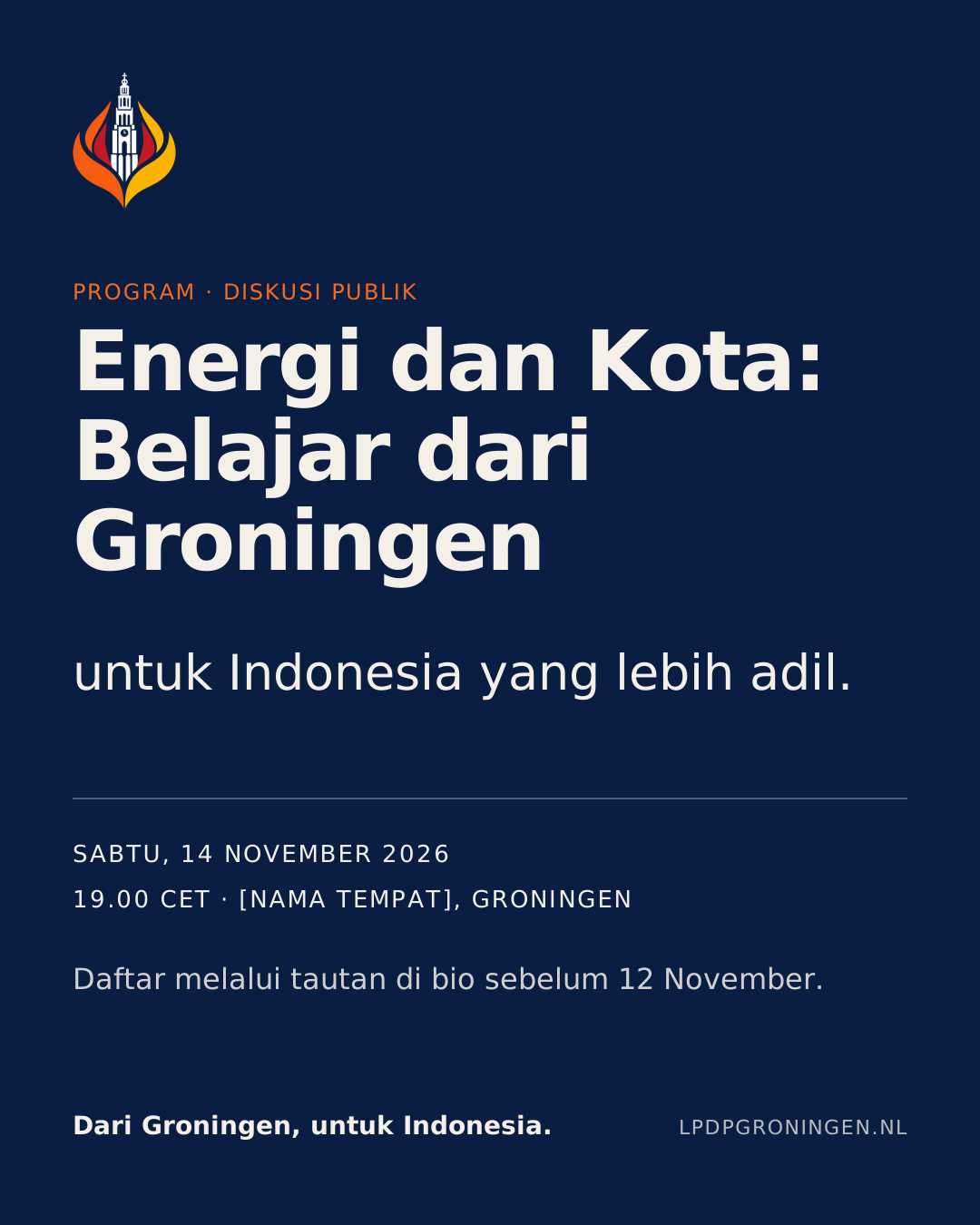
Sabtu, 14 November 2026 · 19.00 CET · [Tempat]
Jika topik ini relevan dengan perjalananmu, daftar melalui tautan di bio sebelum Kamis, 12 November.
Operational facts first; invitation without pressure.
Example
Partnership acknowledgement
Terima kasih kepada [Nama Mitra] atas dukungan ruang dan waktu untuk diskusi ini.
Name partners by their official name; show partner logos only with written permission; never imply an endorsement that does not exist.
Example
Research / awardee spotlight
[Nama] meneliti bagaimana jaringan panas distrik dapat menurunkan emisi di kota menengah. Selamat atas publikasi pertamanya.
Explain research in plain language; get consent before showing names, photos or affiliations.
Proposal — needs approval
Terminology
| Write | Avoid |
|---|---|
| LPDP Groningen | Lpdp groningen, LPDPGroningen |
| awardee | LPDP receiver |
| Rijksuniversiteit Groningen / University of Groningen | RUG without first spelling it out |
| Dari Groningen, untuk Indonesia. | loose translations of the slogan |
07 / Applications
From system to publication.
One primary message, a clear type hierarchy, the logo on the right surface, and operational facts that are easy to scan.
J / Digital
Web, email and everyday surfaces.
LPDP GroningenWeb header
Observed in website code Floating white pill navbar with the normal logo and name in Inter Tight.

CommunityGuidePrivacyBrand Guidelines
Footer
Observed in website code Navy footer with the white logo. A link to this portal is proposed for the website footer’s bottom row (see Governance).
[Nama Lengkap]
[Jabatan], LPDP Groningen
[email] · lpdpgroningen.nl
Dari Groningen, untuk Indonesia.
[Jabatan], LPDP Groningen
[email] · lpdpgroningen.nl
Dari Groningen, untuk Indonesia.
Email signature
Proposal — needs approval Plain text + 128 px logo. Many email clients block images — the text must be complete without the logo.
PENGUMUMAN · ANNOUNCEMENTVolunteer registration is openDeadline: [date]. Details at lpdpgroningen.nl/programs
Digital announcement
Proposal — needs approval One message, one deadline, one link.
Templates
Editable source templates.
SVG files with live text and the approved logo embedded. Open in Figma, Inkscape, Illustrator or Affinity; install the three fonts first. Content inside is sample content — replace every bracketed and example value before publishing.
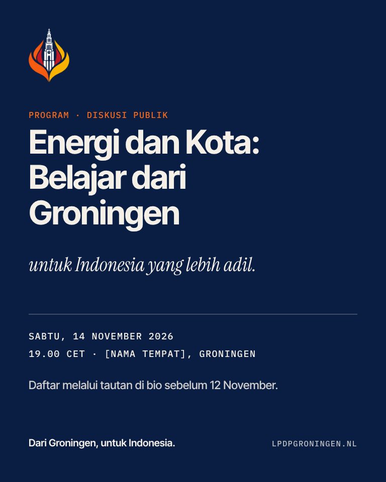
Community event announcement
ExampleAnnounce an event: title, date, time, venue, how to register.
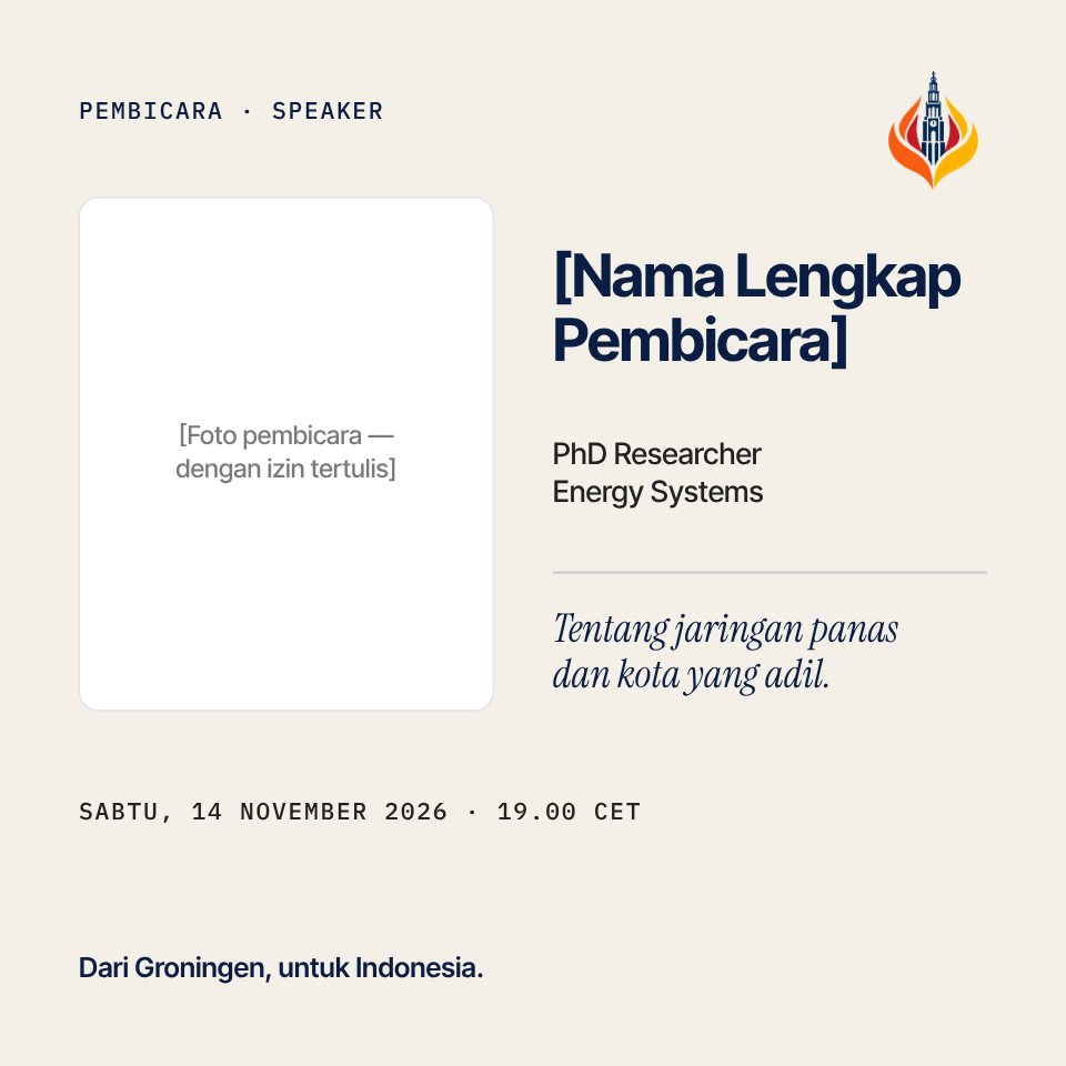
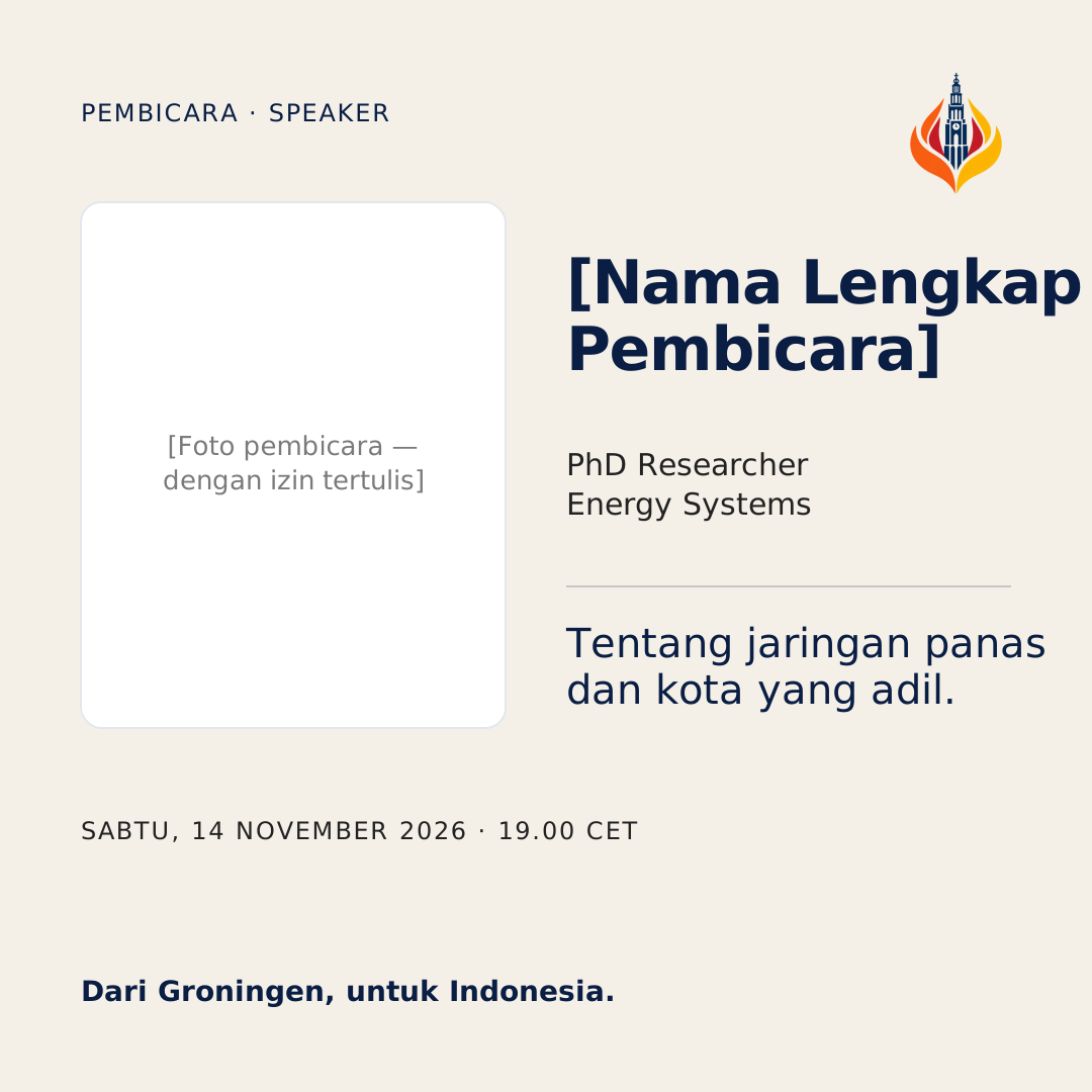
Speaker introduction
ExampleIntroduce a speaker with a consented photo, name, role and topic.
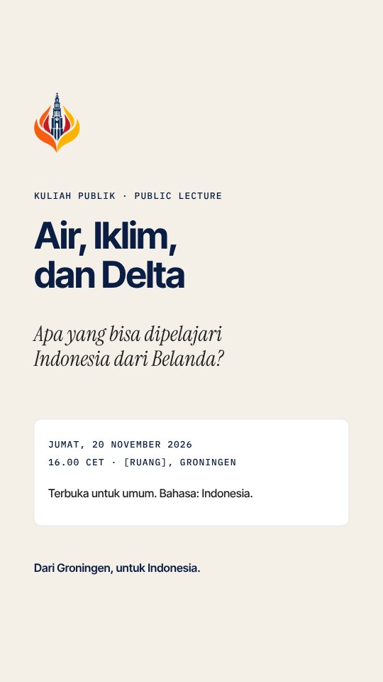
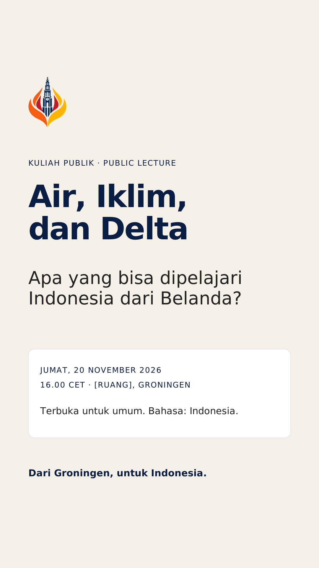
Public lecture / academic discussion
ExampleStory for an academic discussion or public lecture; top/bottom 250 px safe areas kept calm.
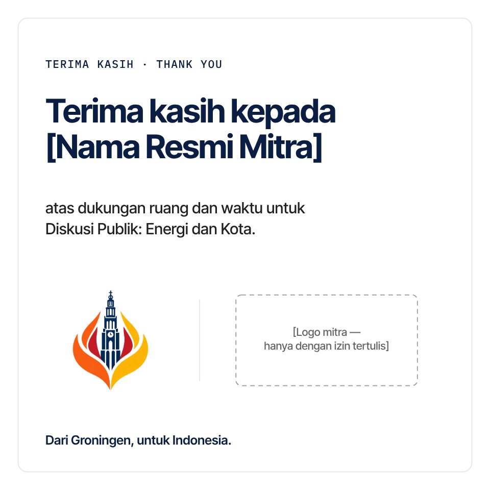
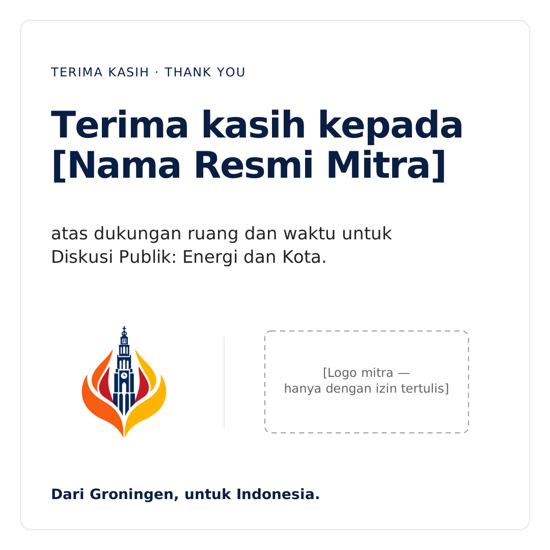
Partner acknowledgement
ExampleThank a partner. The partner logo area stays empty until written permission exists.
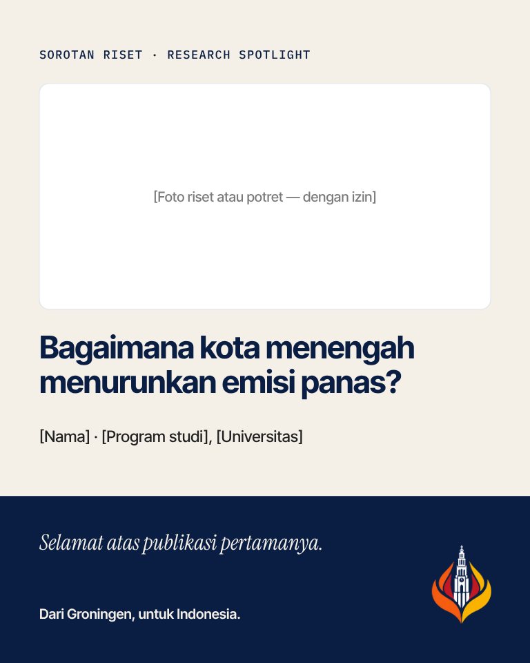
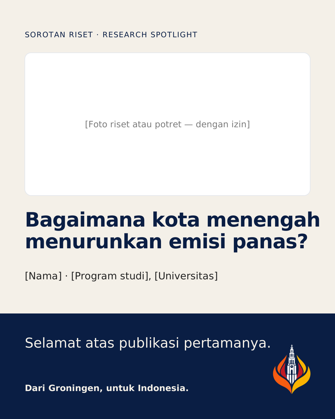
Research / awardee spotlight
ExampleSpotlight an awardee’s research or achievement, with their consent.
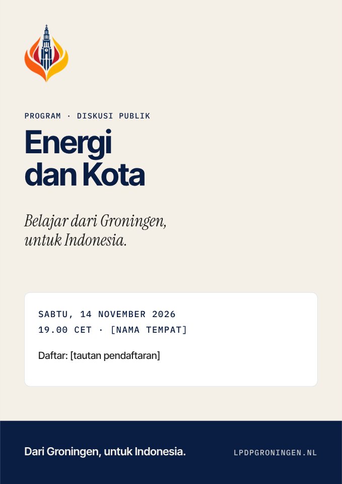
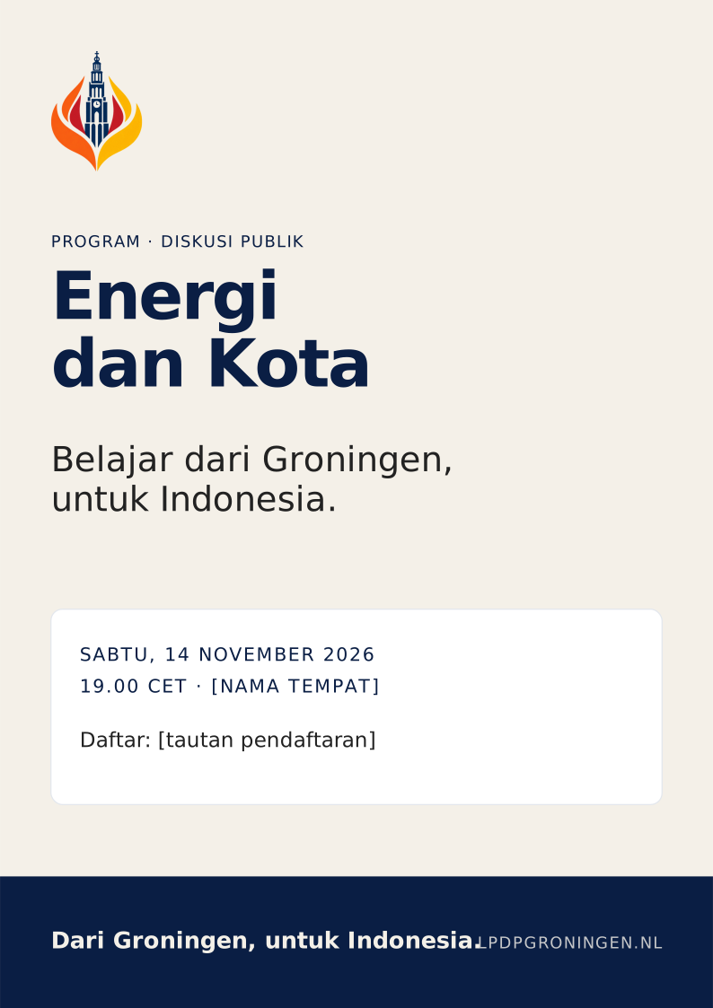
Canva: Editable Canva templates have not been created because no authorised Canva account access exists. Importing SVG into Canva typically turns it into a graphic, not editable text — rebuild in Canva using the Brand Kit. Pending
Export
How to export
- Install Inter Tight, IBM Plex Mono, Instrument Serif.
- Open the SVG, replace the sample text. Do not touch the logo image.
- Social: export PNG at native size (1×). Print: export PDF with fonts embedded.
- Check contrast and spelling before publishing.
Limits
Good to know
- The logo in templates is a 512 px PNG; fine for social and slides, not for large banners.
- Without the fonts installed, apps fall back to other fonts — the result is off-brand.
- Partner logos are added only with written permission.
08 / Downloads
Original files, honest labels.
Every file on this page exists, is listed in the manifest and has a checksum. Only PNG is offered because no authentic vector master exists.
Choose a file
Variant and size.
Web derivatives are downscaled from the master (Lanczos, alpha preserved). No file is upscaled.
| File | Pixels | Size | SHA-256 |
|---|---|---|---|
| lpdp-groningen-logo-normal-original.png | 638×843 | 274 KB | |
| lpdp-groningen-logo-normal-512.png | 387×512 | 119 KB | |
| lpdp-groningen-logo-normal-256.png | 194×256 | 40 KB | |
| lpdp-groningen-logo-normal-128.png | 97×128 | 14 KB | |
| lpdp-groningen-logo-white-original.png | 638×843 | 239 KB | |
| lpdp-groningen-logo-white-512.png | 387×512 | 110 KB | |
| lpdp-groningen-logo-white-256.png | 194×256 | 38 KB | |
| lpdp-groningen-logo-white-128.png | 97×128 | 14 KB |
Originals are byte copies from the website repository. Equality with the canonical R2 objects (logo.png, logo-white.png) is checked with npm run verify:r2. Pending
Packs & documents
Everything else.
ZIP
Logo pack
The 8 approved PNGs, manifest, tokens and licence notice. Contents are checked against the manifest at build time.
PDF
Full guidelines
PDF with selectable text, embedded fonts and a table of contents. Built from the print edition.
Tokens
Design tokens
Colors and fonts for developers.
Templates
- Community event announcementevent-announcement-1080x1350.svg · Instagram portrait 4:5↓
- Speaker introductionspeaker-introduction-1080x1080.svg · Instagram square 1:1↓
- Public lecture / academic discussionpublic-lecture-story-1080x1920.svg · Instagram Story 9:16↓
- Partner acknowledgementpartner-acknowledgement-1080x1080.svg · Instagram square 1:1↓
- Research / awardee spotlightawardee-spotlight-1080x1350.svg · Instagram portrait 4:5↓
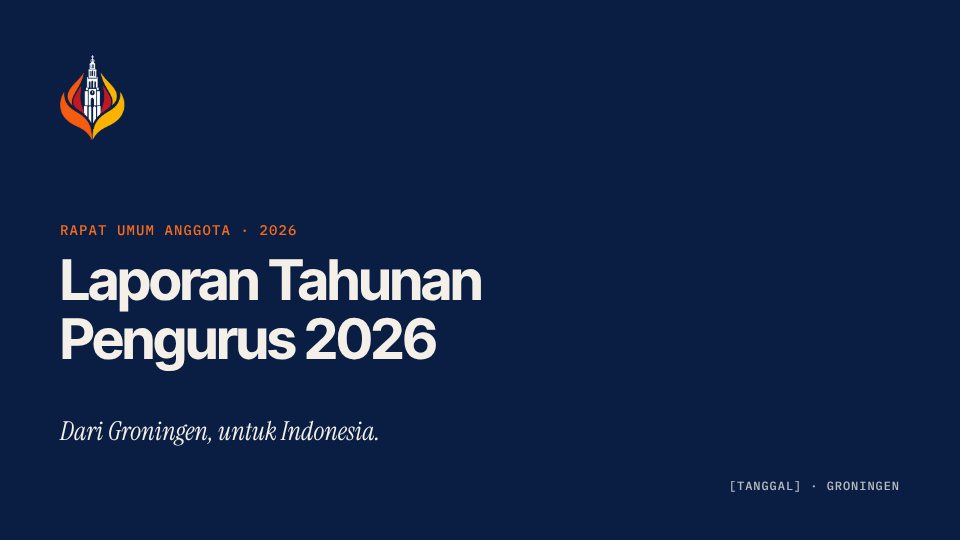
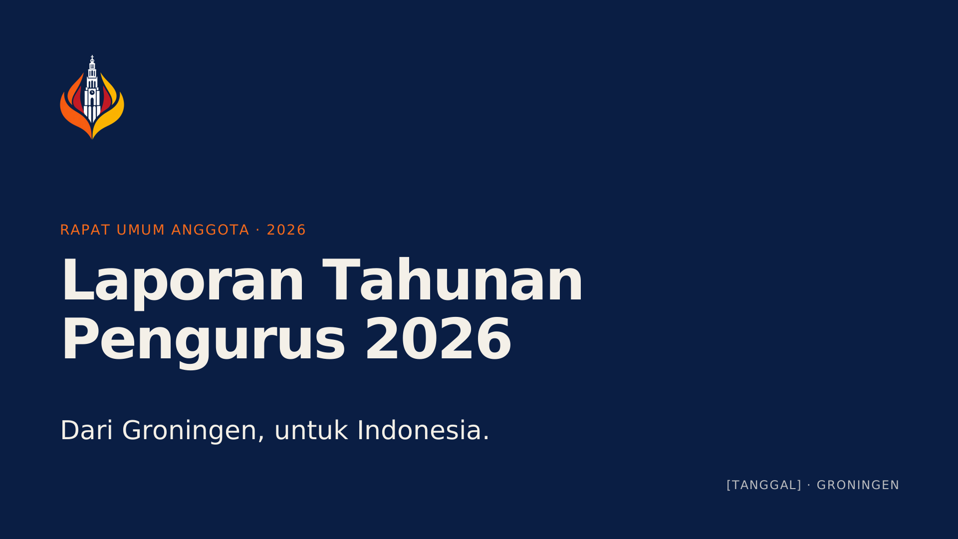
- Presentation title slidepresentation-title-1920x1080.svg · 16:9 slide↓
- A4 event posterevent-poster-a4.svg · A4 (210 × 297 mm, 300 dpi grid)↓
Not available
And why.
Pending
SVG
No authentic vector master exists in the audited repositories. All six LPDP Groningen SVGs embed PNG data.
Pending
PNG 1024 / 2048 / 4096
Master is 638x843; larger files would be upscaled and contain no additional detail.
Pending
Horizontal / stacked lockups
Legacy files use obsolete typography and have no approval record.
Reasons are shown as written in the machine-readable manifest.
09 / Canva Brand Kit
A Brand Kit, assembled with care.
This page is the reference for assembling a Brand Kit in Canva. There is no automatic synchronisation between this portal and Canva — every change has to be updated manually.
Integration status: No verified official Canva Brand Kit, no editable Canva templates, and no API connection exist yet. Canva feature names and plan availability were not verified by this build; follow the Canva interface you see. Pending
Brand Kit contents
Copy exactly.
Colors
Five core colors
Optional supporting: #FFFFFF, #E3E7ED. Do not add other colors.
Logo
Two PNG files
Upload the original PNGs, not the legacy SVGs and not screenshots.
Fonts
Font roles
| Heading | Inter Tight · Bold 700 |
| Subheading | Inter Tight · SemiBold 600 |
| Body | Inter Tight · Regular 400 |
| Metadata | IBM Plex Mono · 400/500 |
| Accent | Instrument Serif · Italic |
If a font is not available in your Canva, uploading fonts requires a plan that supports it. Never silently substitute another font.
Voice
Tone of voice
berkelas · hangat · reflektif · jernih · berirama · inklusif · membumi
A community speaking with people. Operational facts written plainly. Inviting, not pressuring.
Steps
Three routes, one result.
Manual (recommended)
In Canva, open Brand Kit, add the five HEX values above, upload the two logo PNGs, and set the font roles. This route is the easiest to verify.
From a website (if available)
If your account offers building a Brand Kit from a URL, enter
https://brand.lpdpgroningen.nl/en/canva/. Automatically extracted results must be checked — such tools can pick up wrong colors or images.From a PDF (if available)
If import from a document is available, use the guidelines PDF. Check the result with the list below.
Verification
Post-import checklist.
- Exactly five core colors with exact HEX: #F4F0E8, #222222, #0A1E44, #F56A1C, #BB2233.
- No extra colors picked up from photos or illustrations.
- Only two logos: normal and white, PNG 638×843, uncropped and without a background.
- No LPDP institution, university, GroninGeld or partner logos in the community Brand Kit.
- Fonts: Inter Tight, IBM Plex Mono, Instrument Serif — no substitutes.
- Voice matches the Writing & Voice page; not auto-generated promotional copy.
- Record the date and portal version (V 1.0.0-rc.1) in the Brand Kit description.
10 / Governance
Frozen on purpose.
Content adapts to the design, not the other way round. Identity changes are valid only with a written project-owner decision.
Order of authority
If documents conflict, the higher one wins.
ECOSYSTEM_DESIGN_CONTRACT.mdFive core colors and three type roles, across repositories.
ECOSYSTEM_LOGO_SOURCE_OF_TRUTH.mdTwo R2 URLs for the normal and white mark.
PRD_TYPOGRAPHY_FONT_GOVERNANCE.mdFont families and loading rules.
PRD_BUTTON_SYSTEM.md·DESIGN_SYSTEM.mdButtons, cards, image framing, page patterns.
PRD_DESIGN_FREEZE.mdFreeze rules and compliance for new content.
This portal
Documents and operationalises; cannot change the rules above.
All documents live in the canonical website repository muhhilalsudarbi-pixel/lpdp-groningen-web.
Decisions
Who decides what.
| Change | Requires | Status |
|---|---|---|
| Five core colors, three type roles | Written owner decision + ecosystem-level decision (web and GroninGeld) | Approved |
| Logo artwork or R2 URLs | Owner approval + coordinated PR in web, account centre and finance | Approved |
| Shared component styles | Written owner decision; documents and code change in one PR | Approved |
| Clear space, minimum size, new lockups, vector master | Owner approval of this portal’s proposals | Proposal — needs approval |
| Portal content (copy fixes, links, bugs) | Reviewed PR + automated checks passing | Proposal — needs approval |
Exceptions: "Just one page", "just for this event" or "temporarily" are not grounds for an exception. Valid exceptions are recorded in writing in the design freeze with limited scope (example: the website footer, 30 September 2026).
Versioning & provenance
Every file is traceable.
Portal version
V 1.0.0-rc.1 — Release candidate — awaiting owner review. Minor bump for new content, major for approved rule changes.
Asset manifest
SHA-256, size, origin and classification of every file: assets-manifest.json.
Partner logos
Only with written permission from the owner, for a specific publication, and never added to the community asset pack.
Reporting
Found outdated branding?
Report it
Open an issue in the repository lpdpgroningen/lpdp-groningen-brand or contact the committee via the website contact page. Include a link or screenshot, location and date.
Website integration
A footer link "Panduan Identitas Visual / Brand Guidelines / Huisstijlrichtlijnen" to this portal has been prepared as a patch for the canonical repository. Not yet applied. Pending